Level Up Your React Apps with Tailwind CSS: A Step-by-Step Guide

Amarachi Nwokocha
Have you ever had difficulties styling? Or had a rough day because one CSS rule decided to not do what it is meant to do? Is there an end to having multiple style files or cumbersome components because CSS is just being, well, CSS. We need not even mention the countless hours spent in writing and debugging media queries for responsive web design. These and many other problems are what web developers face everyday in order to build web applications that not only work but have beautiful interfaces. Introducing Tailwind CSS, the trusted CSS framework that brings style to life in the twinkle of an eye.
Unlike most frameworks, Tailwind CSS does not have heavy classes. It is more of a shorthand method of writing CSS properties. You can think of it as an accessory added to an outfit to give it that extra pop. Now, what is tailwind CSS and how does it help writing readable and reusable code? And what are its benefits? Let’s take a deep dive to find out more.
NOTE: To fully grasp this guide, a good understanding of React and how to use it is required
Introduction to tailwind CSS
Tailwind CSS is a utility-first CSS framework that provides a set of pre-built utility classes to help quickly build modern and responsive web interfaces. Unlike traditional CSS frameworks that come with pre-designed components, Tailwind focuses on providing low-level utility classes that enable the creation of custom designs without leaving your HTML or in our case JSX. A deeper understanding of Tailwind CSS can be found in my previous article .
Tailwind CSS provides small modular classes that are designed to do one thing in CSS and do it well. These classes are added directly into the className attribute of an element and thereby applies the styles to that element. This is known as the utility first approach. This approach gives developers precise control over styling by allowing for quick adjustments without writing custom CSS. The class names are descriptive and directly represent the applied styles, making the code more readable and self-explanatory. It also makes it easy to combine and modify classes to create custom styles without leaving the HTML file.
This guide is here to help you to:
Break down the essentials of integrating Tailwind CSS with React.
Show you how to set it up without breaking a sweat.
Uncover the treasure trove of utility classes that Tailwind CSS offers.
Share tips, tricks, and best practices for crafting dazzling interfaces.
Setting up a React project
Setting up a ReactJS app can be done using different methods. Developers have various options ranging from using create React App (CRA), using Vite, or any other method they are familiar with. Once the ReactJS app is integrated, installing Tailwind CSS as a dev dependency is pretty straight forward. The guide provided in the Tailwind CSS documentation is easy to read and quick to understand let’s break down the steps.
Note: NodeJS must have already been installed on your machine for any of these steps to work as we will be using npm (Node Package Manager) to run these commands. For information on how to install node and what it is, visit the NodeJS documentation.
In this guide we will be integrating our ReactJS app using vite.
Step 1: In the terminal of your choice, run the following command
npm create vite@latest my-project — — template react
this will create a ReactJs application named my-project. The name of the project can be changed based on your preference. The command can also be:
npm create vite@latest movie-app — — template react
The terminal will look something like this:
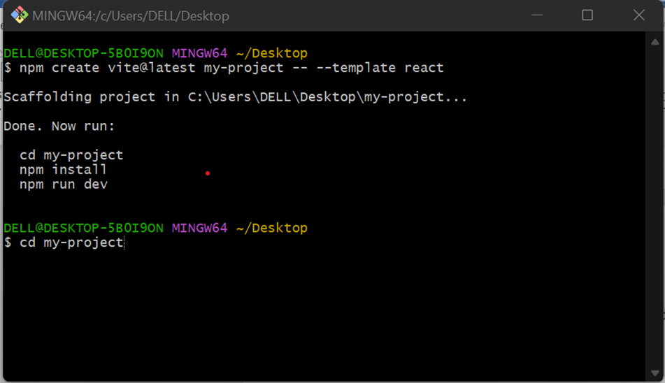
terminal view of tailwind installation.
Prompts to follow will be given such as cd my-project that changes the working directory to the my-project that we just initialized. Next, we run npm install to install the node modules folder and npm run dev if you like, to preview the newly installed app in the browser.
Installing Tailwind CSS
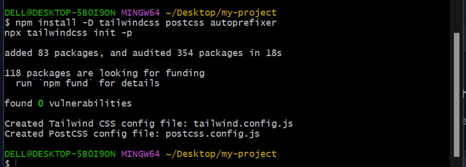
Step 2: Install tailwind css in the project to do this we run:
npm install -D tailwindcss postcss autoprefixer
npx tailwindcss init -p
These will Install Tailwind CSS and its dev dependencies then, generate your tailwind.config.js and postcss.config.js files.
The terminal should look something like this:
Step 3 : configuring template paths.
To do this we open the project in the IDE and make some changes to the tailwind config file. Tailwind CSS provides a tailwind.config.js file in this file, configuration for the entire project goes in here. The first configuration we’d be doing is making changes to the content array. Upon initialization, the tailwind.config.js file looks like this:
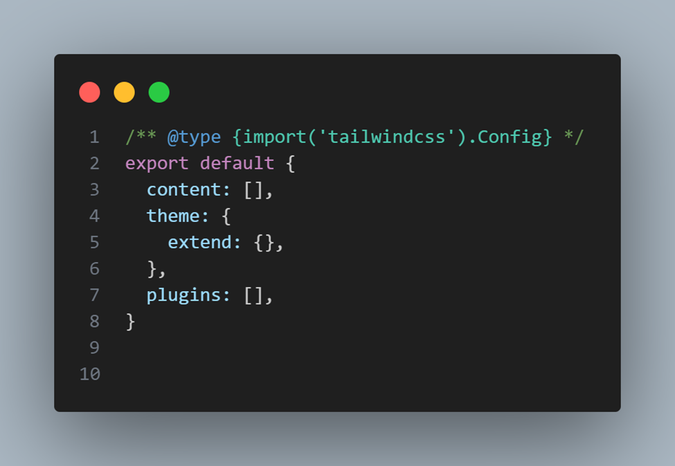
The content section of your tailwind.config.js file is where you configure the paths to all of your HTML templates, JavaScript components, and any other source files that will contain Tailwind class names. As you can see, the content array is currently empty so add the following in the content array
“./index.html”,
“./src/**/*.{js,ts,jsx,tsx}”,
The above code means that index.html and all the JS, TS, JSX, and TSX files in the src directory have access to the Tailwind CSS classes and can use them for styling.
Step 4: Add the @tailwind directives for each of Tailwind’s layers to your ./src/index.css file. These derivatives are:
@tailwind base;
@tailwind components;
@tailwind utilities;
Lets take a look at what each of these mean
@tailwind base; — This injects Tailwind’s base styles and any base styles registered by plugins.
@tailwind components; — This injects Tailwind’s component classes and any component classes registered by plugins.
@tailwind utilities; — This injects Tailwind’s utility classes and any utility classes registered by plugins.
And that’s you’re all set! Integrating Tailwind CSS is as simple as can be!
Integrating Tailwind CSS in React Components
As earlier stated, Tailwind CSS is a utility-first CSS framework that provides a set of pre-defined classes to help in the quick development of responsive and customizable user interface. These classes ae easy to use and very readable lets take a look at some of them.
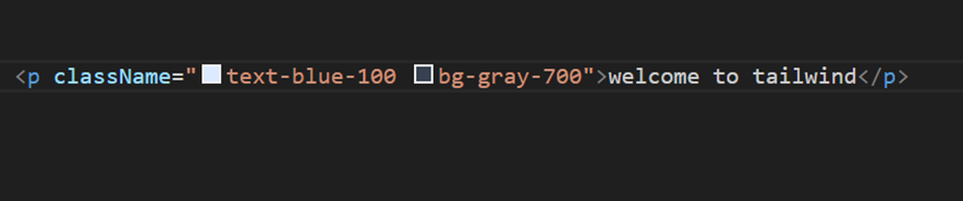
Colors: Tailwind class for colors come in a pattern starting with what the color is for then moving to the color name and then to a number from 50–950 with the colors getting bolder as the number increases. For example, the class “text-blue-100” will add a light blue color to the text and “bg-gray-700” will give an element a background of a deep gray. This pattern works for all colors except black and white which have just one variation: it’s only text-white or text-black.
Font size and styling: Increase a font size of an element in tailwind is set much like the colors. By using the text and then adding the desired size which ranges from xs to 9xl with xs being extra small which is 14px or 0.875rem and 9xl being the biggest size the text can go which is about 8rem or 128px. Changing the font style is very similar to changing the font size. We start with the font and add your desired style. Example, font-bold, font-serif, font-semibold etc.
Padding and margin: Tailwind CSS has a design system that would help you keep a consistent scale across your designs. All you have to know is the syntax for applying each utility. The utilities for adding padding are:
· p — which denotes padding across the whole element
· pb — which denotes padding-bottom
· pl — which denotes padding-left
· pr — which denotes padding-right
· pt — which denotes padding-top
· py — which denotes padding on the top and bottom
· px — which denotes padding on left and right.
The utilities for margin the same just replace the p in padding with m for margin they are:
· m — which denotes margin on all sides of the element
· mb — which denotes margin-bottom
· ml — which denotes margin-left
· mr — denotes margin-right
· mt — denotes margin-top
· mx — denotes margin on the left and right
· my — denotes margin on the top and bottom.
To apply them though, you’d have to use the appropriate numbers provided by Tailwind CSS. These numbers range from 0 to 96 with zero as 0px and 96 as 384px or 24rem.
Flex: To use flex in Tailwind CSS you just need to add a class of flex and the then the desired flex direction. You can customize the layout by using different Flexbox utility classes provided by Tailwind CSS. For example, justify-between, items-center, flex-col, etc.
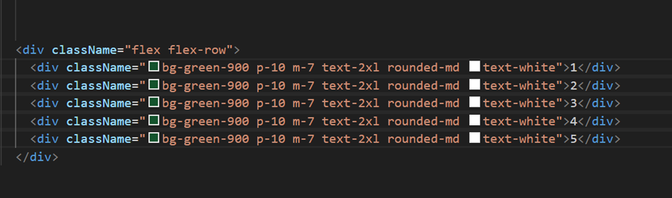
flex in tailwind
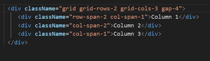
Grid: Much like flexbox, you need to use the grid class and the desired grid direction. The layout can be customized by using the different grid utility classes provided by Tailwind CSS.
Responsive design: In Tailwind CSS, responsive classes allow you to apply styles based on the screen size or viewport width. Tailwind uses a mobile-first approach, meaning styles are applied by default and can be overridden at larger screen sizes. Responsive classes are added using a specific syntax which are:
· sm — min-width 640px
· md — min-width 768px
· lg — min-width 1024px
· xl– min-width 1280px
· 2xl — min-width 1536px
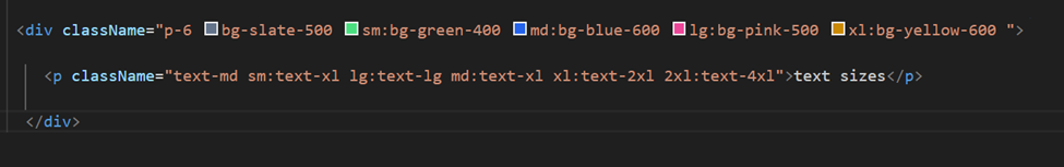
tailwind breakpoint
The above code is an example of how Tailwind CSS responsive design works the background and font-size changes as the breakpoints changes the background will be slate-500 by default but on small screens it’ll be green-400, on medium screen size blue-600, on large screen size pink-500 and on extra-large screen size yellow-600. This concept can be used in making your web applications responsive.
Customization and Extending Tailwind
Though Tailwind CSS provides us with a wide range of colors and font styles, our project sometimes may require a shade of color now present in the pallet. In cases like this, Tailwind CSS provides us with the option of customizing our own colors. To do this, we go into the tailwind.config.js file and in the extend object we add our custom styles lets take colors for example.
To add colors wed need to create a color object and within that object add the colors we need. It will look something like this
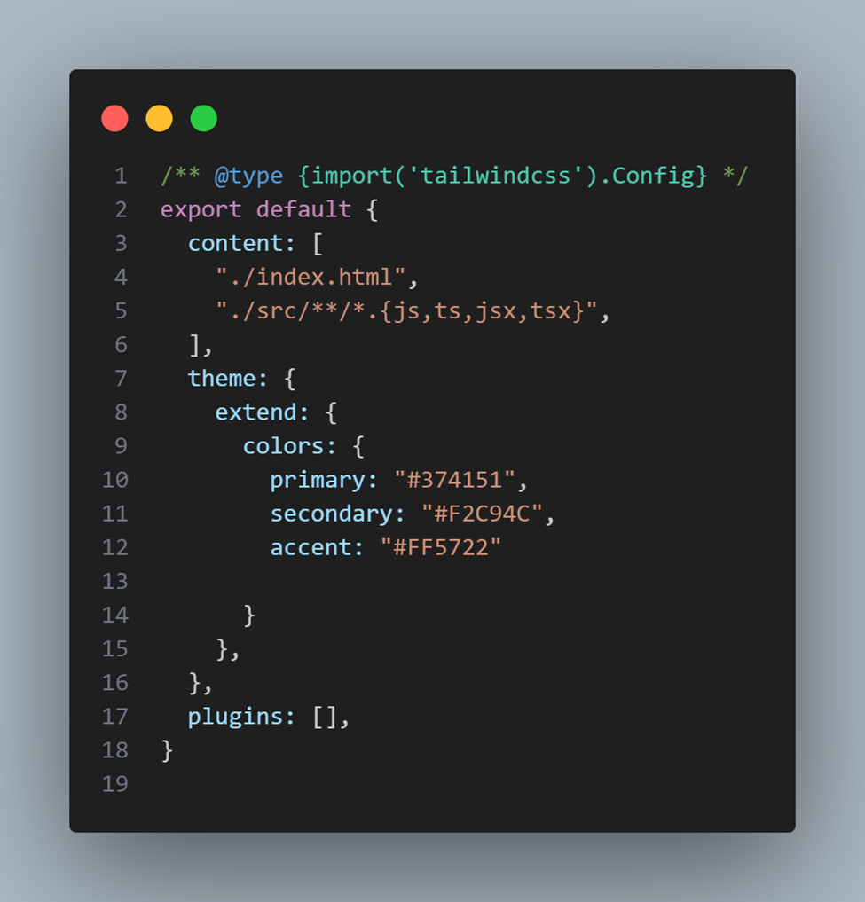
integrating custom styles in tailwind config file.
Here, we added the primary, secondary and accent colors. To use these colors in our project however, all we have to do is add the colors to the text or bg utility for text color and background respectively.
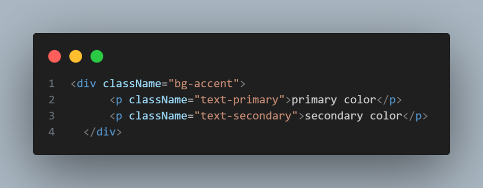
using custom styles in a component
These method can also be used for themes, breakpoint, typography, etc.
Best practices and tips for using tailwind CSS.
Now that we have a good understanding of Tailwind CSS and its amazing abilities, here are some tips I have found helpful while using Tailwind
· Begin by using the default configuration and only add customizations as needed.
· Avoid adding too many unnecessary classes upfront.
· Use breakpoints (sm, md, lg, xl) to adjust styles for different screen sizes.
· Resist the temptation to mix Tailwind classes with inline styles. This can make your code harder to read and maintain.
· Establish consistent naming conventions for custom utility classes to maintain clarity. Avoid generic names; choose names that clearly represent the purpose of the utility.
· Stay updated with the Tailwind ecosystem, including new features, plugins, and best practices.
· Use Tailwind extensions in your IDE like Tailwind CSS intellisense these help you get comfortable with the classes
· Always consult the Tailwind CSS documentation and the Tailwind CSS class list
Tailwind and you.
Tailwind CSS is a wonderful tool for building responsive website and web applications it comes with a wide range of utility classes that allows for rapid development by applying pre-defined classes directly in the components. It also provides a consistent and predictable set of utility classes. This consistency makes it easier for developers to maintain a unified design across the entire project.
Tailwind also helps reduces the amount of CSS code you need to manage, leading to cleaner and more maintainable styles.it is easily configurable with the help of the its tailwind.config.js file, which allows you to customize colors, spacing, breakpoints, and more to fit your project’s specific design requirements.
So, what are you waiting for?! dive deep and explore this wonderful tool enjoy its features and create beautiful web interfaces. I cant wait to see what you build next!